Client
Studio Museum in Harlem
Year
2023
Location
New York
Services
StrategyBrandingBrand GuidelinesPrintDigitalAnimationFilmSocial MediaMerchandiseTypographyExperiential
Awards
Type Director's Club: Certificate of Typographic Excellence
A New Brand for the Studio Museum in Harlem
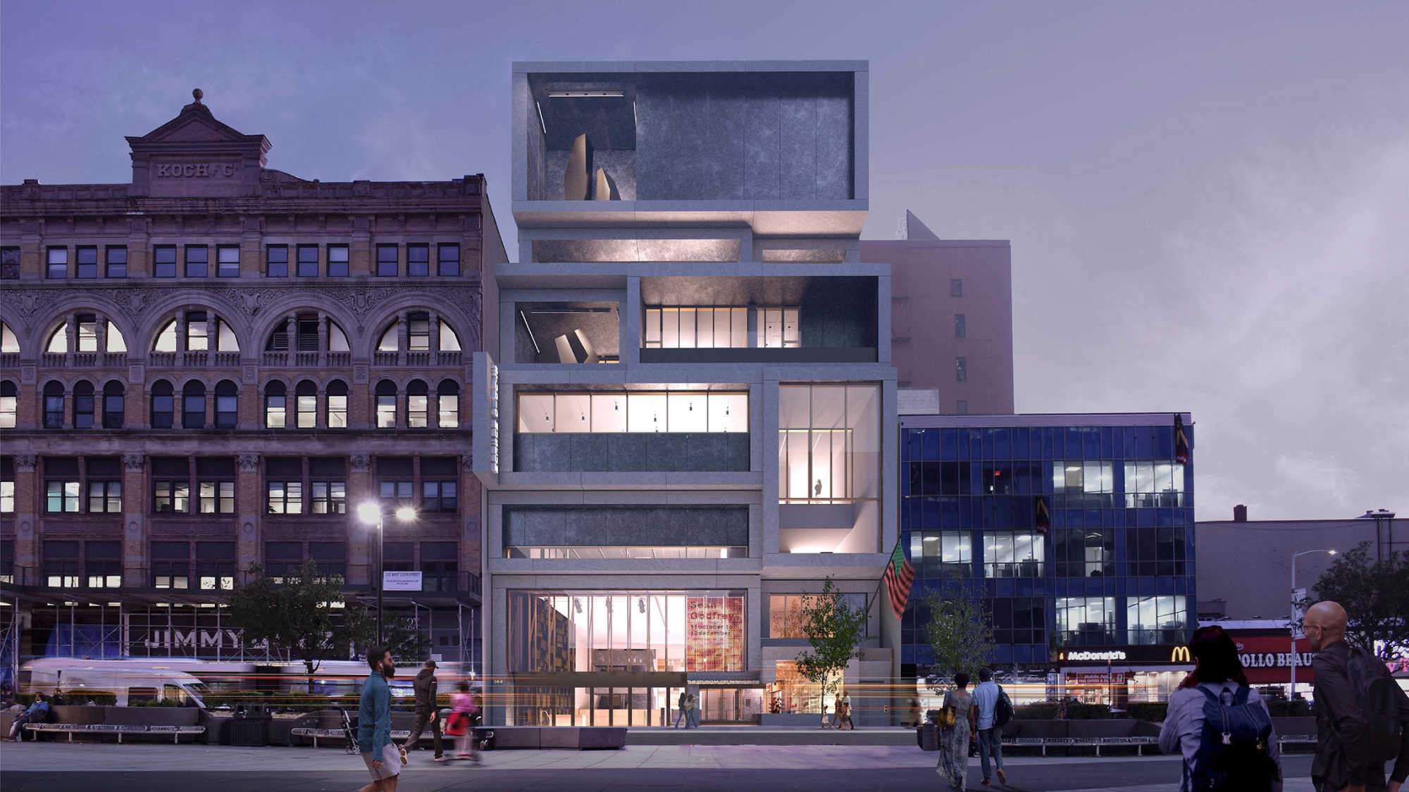
Since its inception in 1968, the Studio Museum in Harlem's identity has been defined by its commitment to creating space for artists of African descent. As the Museum prepares to open its first purpose-built space on 125th street in Harlem, it partnered with Pacific to reimagine a brand that drives forward a legacy of graphic innovation. We developed brand positioning and strategy that centers three foundational pillars conceived from the Museum’s name: Purpose, Connection, and Place. The Museum is a multifaceted brand that is purpose-driven in its role of championing, studying, and safeguarding black artistic expression (Studio); a brand that connects a global cultural community (Museum); and a place-making brand that shines a light on the storied neighborhood (Harlem).
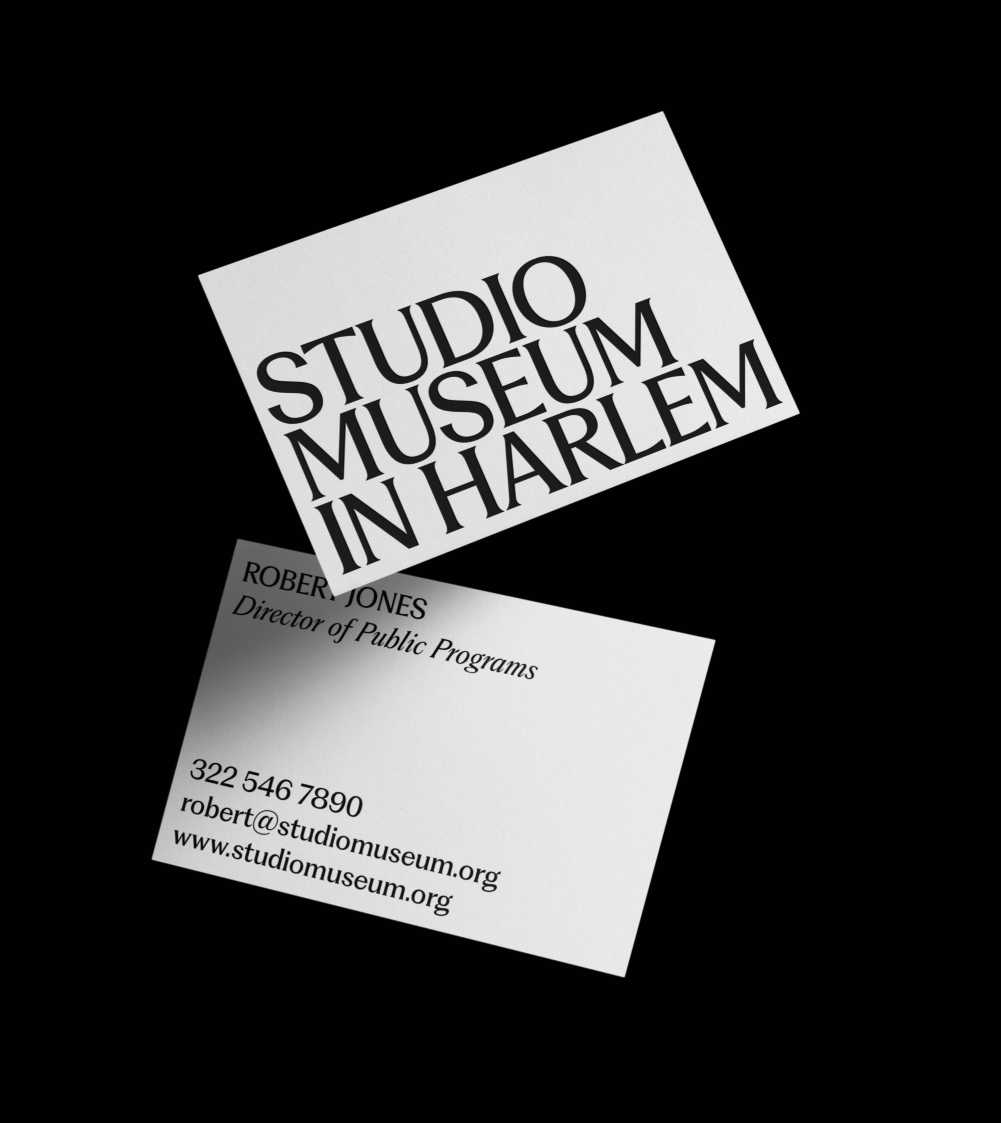
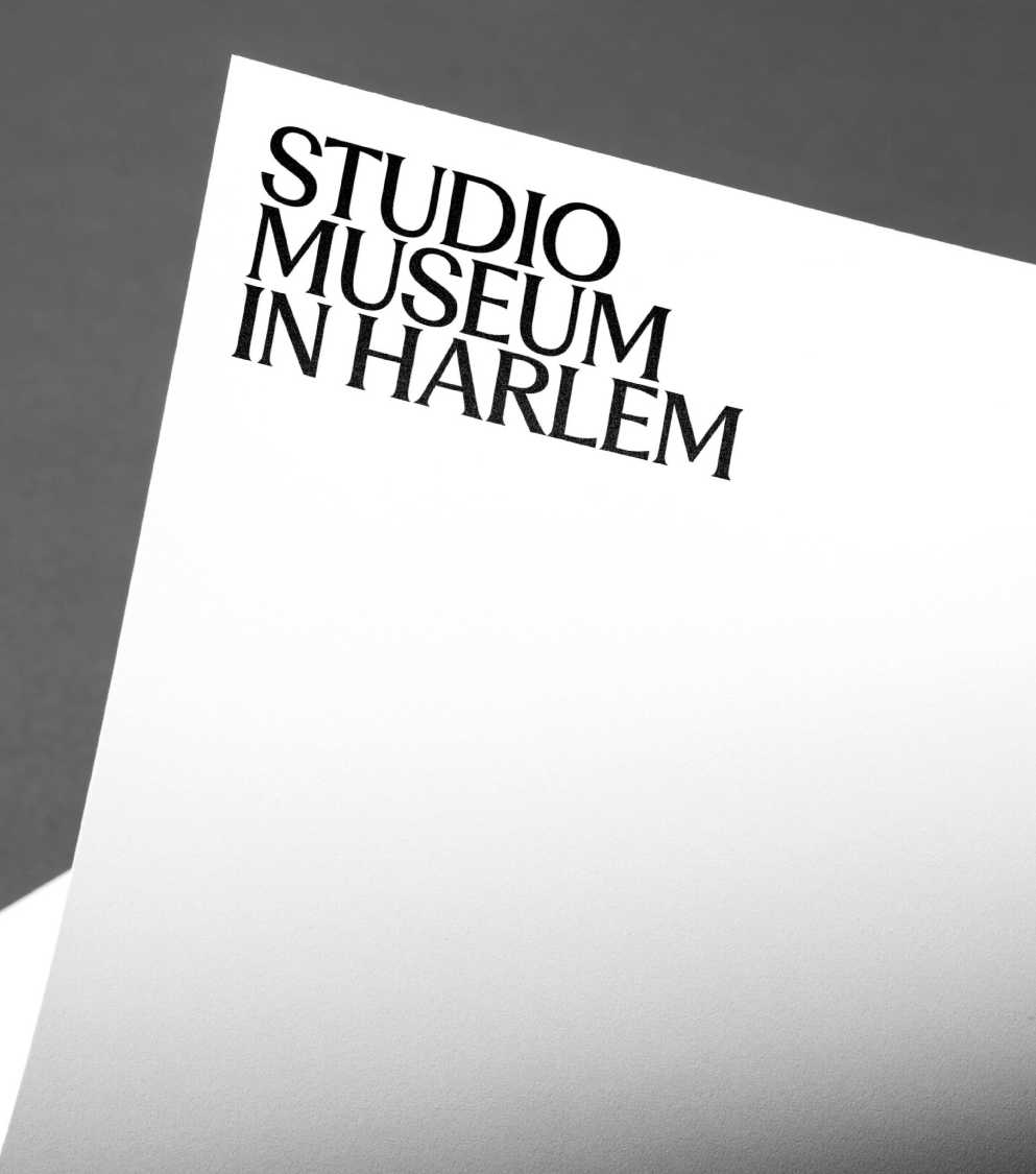
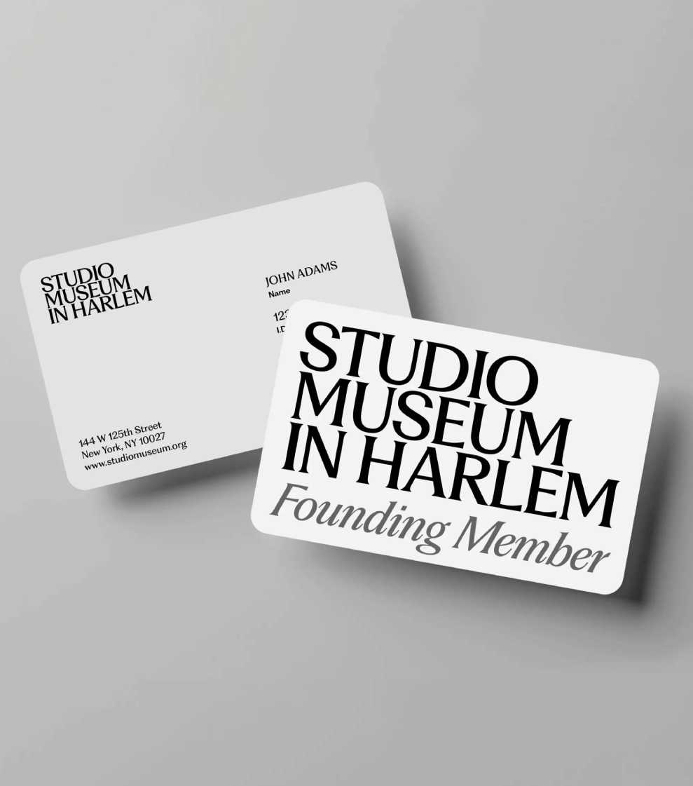
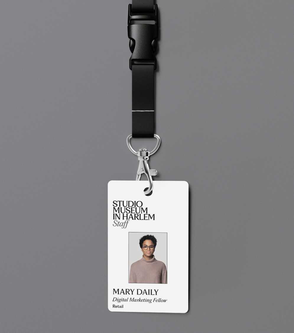
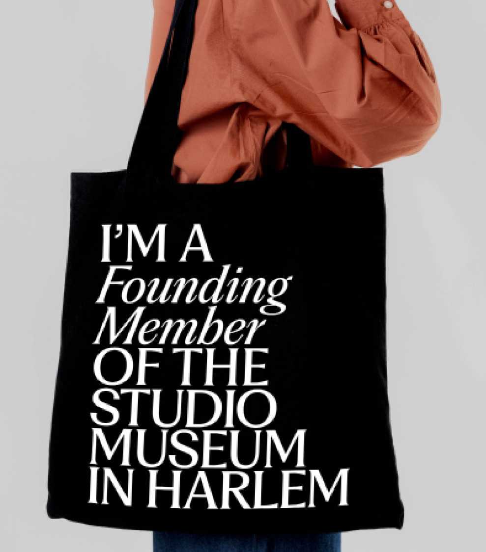
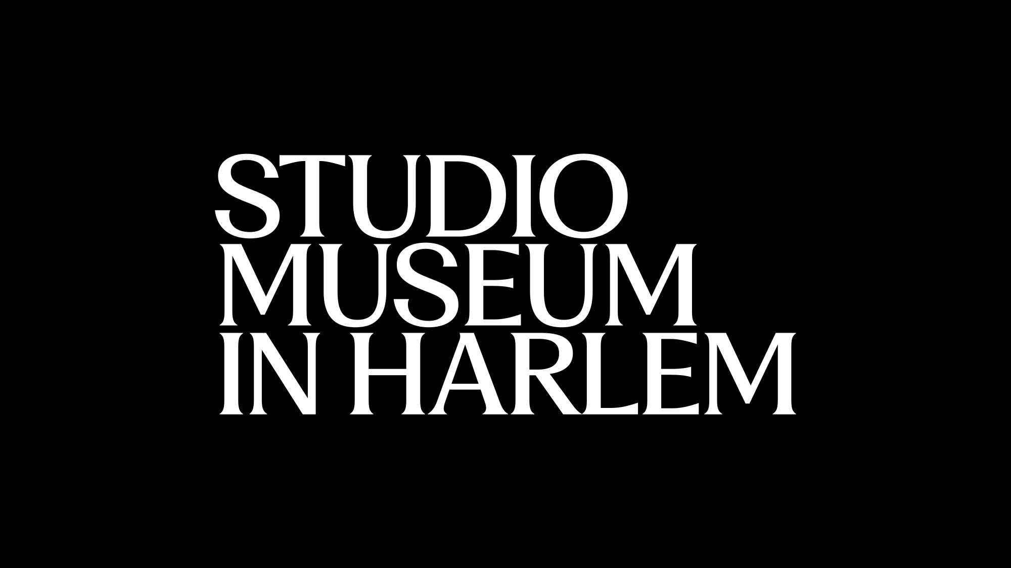
The new logo stands upright, making it easy to adapt and scale across print and digital formats. The visual stacking of the words pays homage to Harlem architecture with the tiers forming what resembles a stoop—an iconic feature of the neighborhood and a reference to a design element of the Museum’s new building. The brand's new typeface (customized from Pangram Pangram Foundry’s Fragment) is named “Studio Museum Black.” A refined and timeless type design, Studio Museum Black was chosen for its elegant yet utilitarian nature. Playing off conventional naming of font weights, where “black” refers to the heaviest and boldest weights, Studio Museum Black is used primarily in a medium weight, defying expectations of what a black font can be.
